The three iamges which are shown above show that when you adjust the photo colours and image size to much, you can lose the photo quality. When the image is made too big or too small then it starts to become pixalated and the quality of that image is lost. Again the same for the colour quality if it is changed too much the biggest effect is not the colour but the quality of the image. So therefore when you are editing images you need to be careful not to manipulate the image to much as the quality of the image is at state. This post goes with my post on file extentions done on Thursday, 8 May 2008.
Thursday, 12 June 2008
M3 What impact of resolution and colour depth have on file size and image quality.
The three iamges which are shown above show that when you adjust the photo colours and image size to much, you can lose the photo quality. When the image is made too big or too small then it starts to become pixalated and the quality of that image is lost. Again the same for the colour quality if it is changed too much the biggest effect is not the colour but the quality of the image. So therefore when you are editing images you need to be careful not to manipulate the image to much as the quality of the image is at state. This post goes with my post on file extentions done on Thursday, 8 May 2008.
Thursday, 5 June 2008
Explain potential legal implications of using and editing graphical images P6
Gaining Permissions
Thursday, 22 May 2008
Preview Film Poster P5
Audience
The film must show the cast members and film title in large text, it needs to display the catch phrase which is "Work HARD play HARDER". It will also need to include some image of a suggestion of school.
Colour
The colour used needs to be bold and bright to catch the public eye.
Final Design
Conclusion
In this design I have chosen to scan the image of school equipment to suggest the theme of school. I have used bright colours such as the red pencil and box. The text colour is white which makes it stand out to the audiences eye. The Title, slogan, coming soon and cast names are clearly shown in large white text. I have chossen to use the file type of a jpeg because it means that i can resize it and still get a good quality picture.
The beginning scanned image
DVD Slip P5
Final Design
Conclusion
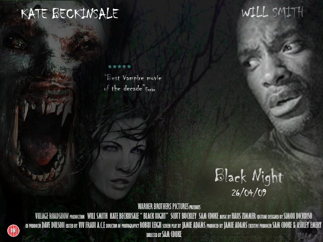
My design was made from the image off trees, and then using different layers i was then able to add images of the vampires and the main stars who are casted in the film. My design does look professional and does make use of the colours which have been suggested. I have chossen to use the file type of a jpeg because it means that i can resize it and still get a good quality picture.
The beginning image
Thursday, 15 May 2008
Film Poster P5
Audience
It needs to to look professional
It needs to look dark
It needs to include images of vampire creatures, woods and people.
Colours
Black, Red and White
Conclusion
My design was made from the image which i took with the camera of a forest are and started off with the picture shown below:
My design does look look professional, and it does look dark to show the horror theme. The image does include pictures of vampires and the woods and also the main characters which are included in the film. I have used the colours of white and black however i have changed the third colour from red to yellow as i though this gave the effect of mist in the forest. I have chossen to use the file type of a jpeg because it means that i can resize it and still get a good quality picture.Beginning Image
Thursday, 8 May 2008
Organics Foods P4 D1
Audience
It needs to look proffesinal
It needs to show the effect of organic products
It needs to show the image of a burger
The word Organic needs to be large.
Colours
Many people represent the colour green to the word organic, so the sign needs to involve the colour green.
Final Design
Conclusion D1
In conclusion the sign does look professional and the grass does give the effect of an organic feel. An image of a burger is used on the poster which helps to show the customer what they are trying to sell quick and is able to catch the drivers eye. The word organic is in green large text.
Software and tools used
I used photo shop cs to design this poster as it includes all the tools i needed to produce my desired outcomes. For example i needed to use the opacity tool to make the grass image fade in the background so the text stands.
File Type
I have saved the image as a jpeg because jpeg it compresses with little loss of the image quality. The image size that i used was 500 x 800, i have used this image size because it can easily be made larger all smaller with out losing the picture quality. However if made to large it could become pixelated.
Microsoft go to Birmingham P4 D1
Audience
It needs to look professional
The company logo needs to be large and the title of the company.
It needs to involve the idea of being happy
Colour Scheme
The colour scheme needs to match the same scheme as the current Microsoft colour’s.
Final Design
D1
My design does reach all of the criteria it does and does look professional, the Microsoft vista logo is currently showing large at the top of the picture, followed by Microsoft and their own slogan. The picture does give the customer the feel of happiness as the people are cheering and look very happy. The picture does not have a colour background and which helps the image of the happy people and logo stand out.
Software and Tools
I have decided to again use the photoshop application to design this poster for Microsoft. This is because i needed many tools to develop this poster.The tools which i used included the blending tool which was used to blend the happy people in to the white background. I also needed to use text effect and photoshop has many proffesional tools and effect which can be added to the text such as shaddow effect which i used. Photoshop is also very useful when it comes to designing the layout, as it has an easy drag and drop interface. I also used the resize and crop tool to many of the images used, this is because i needed them to fit a specigic size to fill the displays canvas size.
Colour Depth
The high colour depth which i used, was to allow the prints out of the poster to be the best quality that they can be so to acheive this i needed to use the highest colour depth that there is. I also needed to make the images which i used within the poster large which was required by the user.
File Format/Size
I again saved the image as a jpeg because jpeg it compresses with little loss of the image quality. The picture size i have chosen to use is 1000x1598, i have chosen to use this because it is a suiable size for a mock up of the actually real life size as i would like the proportions to be the same. I also saved the image as a jpeg so it can be viewed on the internet, also by saving the file as a jepg means that the file is versatile and can be viewed on any computer even without the adobe photoshop software. However this means that file can not be edited once saved as a jpeg but does mean that the file is smaller than the actually photoshop file type.
Encert P4 D1
Whats EnCert
EnCert is a new company providing Energy Certificates to homeowners. They require a logo for their website and letterheads. EnCert needs the logo to look professional and make the clients to associated it with energy (gas, electricity etc).
Energy (Electricity, blue, gas, blue… look at other logos…. Perhaps GREEN for environmental theme.)
Selling 4+ bedrooms houses….. more money people….
The colour scheme
The colour scheme needs to be warm and use colour’s which could represent of electric and gas.
Final Design
Conclusion D1
The following picture does meet my requirements as it has a warm and energy feel to it, and it looks professional. The leaves in the picture and windmill suggest to the customer that it is energy efficient.
Tools and software
I have decided to use the photo shop application to design the logo. I needed to add text effects, clone different shapes in the image and change the contrast levels, so this makes photo shop ideal to use. By using these tools it makes the logo more proffesional and look like a logo which can actualy be used for the face of the company
File Type
I again saved the image as a vector image because then the user can make the picture larger and smaller without making the picture distorted. The picture size i have chosen to use is 500x800, i have chosen to use this because it is a suitable size for an logo. By using a vector image it makes it easy when reusing it over and over, for document headers, in emails and other places where the logo needs to be displayed.
Thursday, 17 April 2008
Which is better?
Graphic Facilities which are Embedded
Photo Manipulation
Bitmap Images
Vector Images
D2 Evoloving Technology
Printers
There are three types of printers:
Dot Matrix
These printers are popular for producing graphical images. The printer has a grid of tiny pins to transfer ink from a ribbon to the page. Dot matrix printers can produce basic graphics, but are not as good as an inkjet printer's quality. They're loud and slow.
Inkjet Printer
This printer shoots fast-drying ink through small nozzles onto paper to form images. Many people at home and small companies use an inkjet printer as their standard printer is currently the standard. Inkjets are fast, affordable, and relatively quiet. They are high-quality graphics, and they print in color.
Laser Printer
Laser printers use static electricity and heat to produces imaged on to paper. Many offices, business use laser printers to produce fast and good quality black text. However they are expensive to run as the toners cost a lot to buy.
All of these printers are used today and can be still found in different situtations.
Monitor
LCD Monitors
LCD (liquid crystal display) monitors are modern. Inside the screen is a matrix panel, the panel is connected to a chip which which address the display with the picture data, and are driven by the rest of the monitors electronics. These monitors are reasonably expensive compared to others. The speed of the screen depends on the referesh rate and speed of the computer, the higher the refresh rate the faster the screen will react.
Require less power
Smaller and weigh less
More adjustable
Less eye strain
CRT Monitors
A CRT monitor contains millions of tiny red, green, and blue phosphor dots that glow when struck by an electron beam that travels across the screen to create a visible image. They are old technology compared to the new LCD Monitors which are used mostly today. These monitors however are cheap compared to LCD.
Images can blur
Bright areas can cause other areas to dim
Lacks text contrast
Not pixel based
It is now clear that the new LCD monitors are better for you then CRT monitors this is because they are better for your eyes and produce a clearer image than CRT, for the main reason that they use pixals.
Thursday, 13 March 2008
Upgrade the system P2 M1
Intel Pentium D 'Dual Core X2' CPU (5.3 Ghz)
VIA Chipset 1066 Mhz Motherboard - slots available: AGP8x (1), PCI (3), RAM (2); ports available: LAN (1), USB (6)
512 MB RAM
80 GB HDD (SATA300)
18X DVD+/-RW Dual Layer & Dual Format
onboard UniChrome PRO 3D Graphics with 64 MB shared memory
mouse and keyboard
15" flat screen
cheap inkjet printer
-------------------------------------------------------------------------------------------------The system shown, could have the ram, graphics and the screen could all be upgraded. The Ram which is in this system is only 512 and neededs to be upgraded to 1GB or more for the computer to work effeciently when editinng and creating graphical images, otherwise expect a lot of system crashes. The same goes for the the graphics card which is onboard, which will have some problems when being used in graphic software packages. The graphics card will need a higher memory from at least 512mb and above. The screen will needed to be larger to at least 21", to be able to get the most of their computer.
-----------------------------------------------------------------------------------------------This is sutable ram for the system:
Kingston ValueRAM memory - 1 GB - FB-DIMM - DDR II - 400 MHz
HEWLETT PACKARD HP Memory/1GB - DDR II SDRAM -667 MHz
The best of the two ram which i have chossen is the HP Ram compared to the Kingston ram. Even though they both are 1 GB the HP ram has a speed of 667 MHz and the kingston has a speed of 400MHz. So this means that the Hp ram can preform faster than the other 1 GB ram. Which is what we want when we are editing photos on computers as most applications today need alot of ram to run the program because of all the tools used.
This is sutable Graphics for the system:
Bus Connector - PCI Express x16
Graphics Processor / Vendor - GeForce 8500GT
RAMDAC Clock Speed - 450 MHz
API Supported - DirectX: DX9.0-10.0
Memory Interface - 128-bit DDR2
Outputs - VGA, DVI-I DUAL LINK HDTV-OUT
This is sutable Monitor for the system:
flat panel display 22"
Brightness
300 cd/m2 (typical)
Max Resolution
1680 x 1050
VGA (HD-15)
Contrast Ratio
100:1
24" Widescreen
Height, Swivel, Tilt
Anti-reflective, Hard coating
Picture in picture
sRGB colour management
Contrast Ratio700:1
Brightness 500 cd/m2 (typical)
The monitor that i have chossen is the second one. The main reason for this choice is the size of the monitor which is 24", a bonus of this monitor is the abliity to tilt the monitor. The contrast ratio of this monitor is alot better than the 1st one which was 100:1 and the second one is 700:1 this is clearly has the better ratio. This is because the larger the contrast ratio the greater the ability there is to show colour details. Again the second one has better brigtness abilities, this is because the 1st one only has 300 cd/m2 and the second screen has 500 cd/m2, and again the higher the candela per square meter the higher the brightness can go, this does not instantly mean that the monitor will be better but is helps alot to see the screen in different light situations.
Whats required for using graphical images? P1
A mouse is the key way of communicating with the computer itself. Without the mouse you are not able to manipulate graphical images.
SCREEN
This is where the operating system can be shown to the user in a GUI,
GRAPHIC TABLET
This is a mouse replacement, pressure sensitive pen and tablet. It works more efficiently than a mouse. You can customise pen buttons to any mouse button or invoke commands such as Undo, Copy, Paste. You can use the pen to draw or trace. A graphic tablets allow the user to work in a powerful, time saving way .
DIGITAL CAMERA
A digital camera allows you to electronically import a version of the picture to the computer. A digital camera allows you to take more of the picture that you actually see with a high mega pixel size.
SCANNER
Scanners can be used to convert text documents or photographs into digital files.
FLASH CARDS
Flash cards are storage for many portable objects which are often used to store the photos from digital cameras.
USB
The USB is portable and can be taken to any computer that has a USB, they are used for storing files from office files to images.
HARD DRIVE
The hard disk drive (HDD) is a magnetic drive that stores a great amount of data that is fixed on to the hard drive. A hard drive
is a non-volatile storage device which stores digitally encoded data on rapidly rotating platters with magnetic surfaces.
GRAPHICS CARD
This is the component that puts the images on to the monitor. There are many different types of graphics card from different generations, and different years. An easy way to see if I graphics card is any good is by the memory of which it holds (cash) and the clocking speed of the card and its refresh rate.
PROCESSORS
The processor, is the component in a digital computer capable of executing a program, and controls everything and gives the computer all of its instructions to run the operating system.