Thursday, 22 May 2008

Preview Film Poster P5

The final design which i have been asked to do, is to make a preview film poster for a new film which has been announced and will be coming out later next year. The film is called schools out and is about a two teenages who leave home for the summer with their older and younger sister. They then travel the USA and fly to the UK to discover what the UK has to offer for them.

Audience

The film must show the cast members and film title in large text, it needs to display the catch phrase which is "Work HARD play HARDER". It will also need to include some image of a suggestion of school.

Colour
The colour used needs to be bold and bright to catch the public eye.

Final Design


Conclusion


In this design I have chosen to scan the image of school equipment to suggest the theme of school. I have used bright colours such as the red pencil and box. The text colour is white which makes it stand out to the audiences eye. The Title, slogan, coming soon and cast names are clearly shown in large white text. I have chossen to use the file type of a jpeg because it means that i can resize it and still get a good quality picture.

The beginning scanned image

DVD Slip P5

I need to design the DVD slip that will be inserted on the outside of a new horror film called the Black Night. The film is about a group of friends who go out in the night and experience a dram tic experience, including vampire like creatures. When the friends need to defend for their life when they fight the head vampire, who turns out to kill them all. The DVD slip needs to include a professional front cover to sell the film and a blurb on the reverse side of the DVD, it will also need to include all the details of the film including the age rating, which is an 18. This will be made from the image that i took of trees.
Audience
It will need to look professional and include pictures of vampires and the main characters which star in the film. It will need to sell the film to the audience, and make it look like a horror film.

Colours
Black, white and red

Final Design


Conclusion


My design was made from the image off trees, and then using different layers i was then able to add images of the vampires and the main stars who are casted in the film. My design does look professional and does make use of the colours which have been suggested. I have chossen to use the file type of a jpeg because it means that i can resize it and still get a good quality picture.


The beginning image


Thursday, 15 May 2008

Film Poster P5

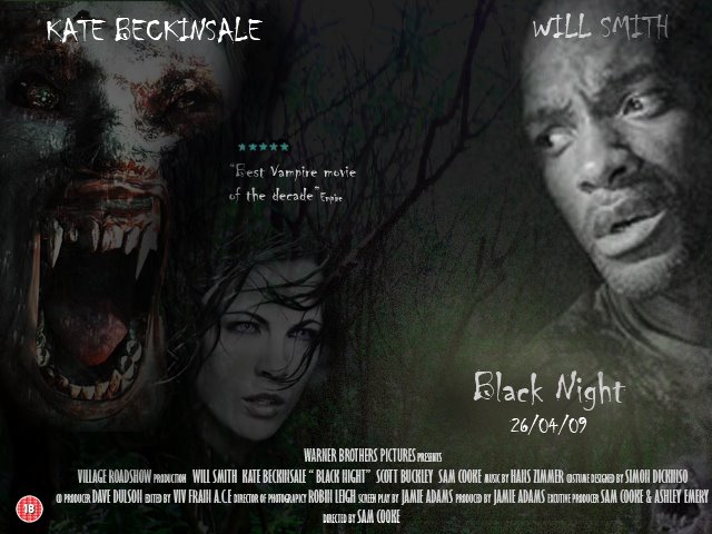
I need to design the poster for a new horror called the Black Night. The film is about a group of friends who go out in the night and experience a dram tic experience, including vampire like creatures. When the friends need to defend for their life when they fight the head vampire, who turns out to kill them all.

Audience
It needs to to look professional
It needs to look dark
It needs to include images of vampire creatures, woods and people.

Colours
Black, Red and White


Final Design


Conclusion


My design was made from the image which i took with the camera of a forest are and started off with the picture shown below:

My design does look look professional, and it does look dark to show the horror theme. The image does include pictures of vampires and the woods and also the main characters which are included in the film. I have used the colours of white and black however i have changed the third colour from red to yellow as i though this gave the effect of mist in the forest. I have chossen to use the file type of a jpeg because it means that i can resize it and still get a good quality picture.
Beginning Image


Thursday, 8 May 2008

Organics Foods P4 D1

An organics foods mobile fast-food service has requested a roadside sign. It will be used on a stand so when its van is parked in a lay-by offering quality burgers and all-day breakfasts, passing motoists will notice it.

Audience
It needs to look proffesinal
It needs to show the effect of organic products
It needs to show the image of a burger
The word Organic needs to be large.

Colours
Many people represent the colour green to the word organic, so the sign needs to involve the colour green.

Final Design

Conclusion D1

In conclusion the sign does look professional and the grass does give the effect of an organic feel. An image of a burger is used on the poster which helps to show the customer what they are trying to sell quick and is able to catch the drivers eye. The word organic is in green large text.

Software and tools used

I used photo shop cs to design this poster as it includes all the tools i needed to produce my desired outcomes. For example i needed to use the opacity tool to make the grass image fade in the background so the text stands.

File Type

I have saved the image as a jpeg because jpeg it compresses with little loss of the image quality. The image size that i used was 500 x 800, i have used this image size because it can easily be made larger all smaller with out losing the picture quality. However if made to large it could become pixelated.

Microsoft go to Birmingham P4 D1

ep Microsoft has approached Visual Impact to produce some displays for its stand at a show to be held in the Birmingham NEC publicising its newest operating system. Produce a graphic that could be printed onto a large piece of card to be used on the Microsoft stand.

Audience
It needs to look professional
The company logo needs to be large and the title of the company.
It needs to involve the idea of being happy

Colour Scheme
The colour scheme needs to match the same scheme as the current Microsoft colour’s.

Final Design

D1

My design does reach all of the criteria it does and does look professional, the Microsoft vista logo is currently showing large at the top of the picture, followed by Microsoft and their own slogan. The picture does give the customer the feel of happiness as the people are cheering and look very happy. The picture does not have a colour background and which helps the image of the happy people and logo stand out.

Software and Tools

I have decided to again use the photoshop application to design this poster for Microsoft. This is because i needed many tools to develop this poster.The tools which i used included the blending tool which was used to blend the happy people in to the white background. I also needed to use text effect and photoshop has many proffesional tools and effect which can be added to the text such as shaddow effect which i used. Photoshop is also very useful when it comes to designing the layout, as it has an easy drag and drop interface. I also used the resize and crop tool to many of the images used, this is because i needed them to fit a specigic size to fill the displays canvas size.

Colour Depth

The high colour depth which i used, was to allow the prints out of the poster to be the best quality that they can be so to acheive this i needed to use the highest colour depth that there is. I also needed to make the images which i used within the poster large which was required by the user.

File Format/Size

I again saved the image as a jpeg because jpeg it compresses with little loss of the image quality. The picture size i have chosen to use is 1000x1598, i have chosen to use this because it is a suiable size for a mock up of the actually real life size as i would like the proportions to be the same. I also saved the image as a jpeg so it can be viewed on the internet, also by saving the file as a jepg means that the file is versatile and can be viewed on any computer even without the adobe photoshop software. However this means that file can not be edited once saved as a jpeg but does mean that the file is smaller than the actually photoshop file type.

Encert P4 D1

Whats EnCert

EnCert is a new company providing Energy Certificates to homeowners. They require a logo for their website and letterheads. EnCert needs the logo to look professional and make the clients to associated it with energy (gas, electricity etc).

Audience
Energy (Electricity, blue, gas, blue… look at other logos…. Perhaps GREEN for environmental theme.)
Selling 4+ bedrooms houses….. more money people….

The colour scheme
The colour scheme needs to be warm and use colour’s which could represent of electric and gas.

Final Design


Conclusion D1
The following picture does meet my requirements as it has a warm and energy feel to it, and it looks professional. The leaves in the picture and windmill suggest to the customer that it is energy efficient.

Tools and software

I have decided to use the photo shop application to design the logo. I needed to add text effects, clone different shapes in the image and change the contrast levels, so this makes photo shop ideal to use. By using these tools it makes the logo more proffesional and look like a logo which can actualy be used for the face of the company

File Type

I again saved the image as a vector image because then the user can make the picture larger and smaller without making the picture distorted. The picture size i have chosen to use is 500x800, i have chosen to use this because it is a suitable size for an logo. By using a vector image it makes it easy when reusing it over and over, for document headers, in emails and other places where the logo needs to be displayed.

Graphic File Extensions